Tuesday 25 October 2011

Lecture 5, ITAP – Research Graphic Communication turned to photography

           It may be seen easier to write about legibility within the typography of signs and papers but in reality typography and image is everywhere we look, magazines, adverts, books, CDs, DVDs, posters, billboards, apps, websites, the list goes on. Words are seen as a powerful device but images can be seen as even more powerful. So what effect does this have when teamed together? Magazines overload us with type and image, connecting the two together to create influential selling tools, to make money, much like the dominance of advertising. From simple portrait photography with strong, bold, fairly large text on a jet black background, which works effectively in drawing the eye across the page from the red, perfect lips of the model to the other side of the page where the lipstick to make your lips too look that good stands, with the bold red caption. Chanel are successful in understanding how a magazine works, that you’ll first see the woman on the right hand side as you open the magazine, along with the power of image and texts and product which leads to a successful advertising. That is what is extremely successful throughout the magazine industry, and is what makes buyers buy and advertisers/companies sell as we can see time and time again through each magazine spread. For instance Channel in the ‘Rouge Allure’ advert use a simple typeface, relating colour to the colour of the product, the lipstick, and using the contrast of white against the black background for other type, depicting that the red will hugely enhance legibility. Also there is little writing on the advert, so as to get to the point as quickly as possible because most people just flick through magazines and needs to penetrate the reader as soon as possible and be to memorable. It is unarguable that this technique works as it is seen in every possible way on every possible surface used to advertise, although tweaked for different medias, the idea stays the same and it sells. It may be seen as boring and reproduced but we still go out and buy what’s out there with clever advertising slogans and appealing shades of lipstick interspersed with the beautifully photo-shopped photographs. Image and text is all around us and is put in the simplest way possible, with the simplest legibility because it’s all about quick fire messages as in today’s era we are overloaded with masses of information and everybody wants their information to stick.


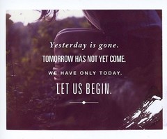
            Tone of voice is often something that can be seen as something to comply with or something to break in all forms from how words are placed on a page, to what font they are in etc. One area that particularly interests me is how font is used in image and where it is placed and if it in fact has anything to do with the image, and how words and images are interwoven together. There’s a website I love called ‘wehearit’, I guess you would call it a visual blog and mass of ideas, but amongst that you can find thousands of uses of tone of voice and image and text. One way of interlinking text over an image, for instance in the ‘yesterday is gone’ image, is to use a different font for every line, it may not be seen as conventional and as legible as some typography out there but it creates an interesting effect upon what you are reading, also through using different size of font it draws your eye to what the creator wanted you to remember and to be most significant from what is being said. By having font in the center of an image it also shows that they want the text to be the main focus point for the picture, as maybe what is being said is more important than the image itself. Another example where the text is the main focal point in an image is in the ‘I used to sleep at night’ picture, your eye is drawn to the white against the darker ‘rave scene’ background photograph. An example of this when maybe it hasn’t been so successful is in the ‘boy you had your chance’ image. The text although well placed across the entire image, so as to portray that the image has little importance compared to what is being said, it disappears into the picture in the background, which in turn makes it illegible and which then defeats the point of the image as a whole. But when text is used successfully, I think it can have a powerful effect even on maybe less ‘interesting’ images. 


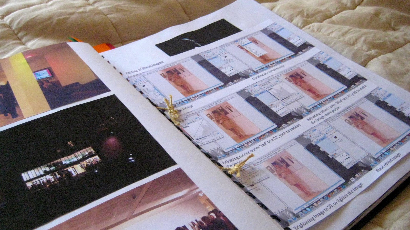
Examples of 'Report it' Page:


Tuesday 18 October 2011

Lecture 4, ITAP - What is key to reliable and creative process? (Inspiration and understanding)

As creative people we collect, enquire, record and inspire ourselves to create works of what we are interested in. But to achieve inspiration in the first place first we must research. To start these creative flows, usually we look around ourselves to see what interesting things are amongst us, to firstly gain inspiration. But we also look around us to other practitioners, and understanding other practitioners work and the journey they made to the final outcome often helps us better understand our own journeys and discoveries. Two artists Kiki Hartmann and Dorte Nielsen questioned what went on behind the scenes of the creative practitioner, so they set off around Europe in search of artists and practitioners from all disciplines to see how they create their unique, original ideas. They were shown sketchbooks and work spaces and even bottom draws, and their conclusion was that hard work and everyday objects, the skill of putting everything into a sketchbook made the creative, beautiful final outcomes. Paul Davis said: “Notebook after notebook after notebook, because I feel sick when I forget a potentially good idea.” What is learnt from others is that we should record, paste down everything that could one day inspire a great idea, we should inspire not to imitate but to innovate. Saul Steinberg famously said that: “The whole history of art influences me”, there is a world of creativity out there, people creating every hour of everyday, to immerse yourself into the creative world means that you have to live and breathe and even sleep it too.

            But creating can’t just be about random artifacts and ideas, it has too – eventually – have meaning. Not one practitioner can say that his/her art is for everyone, for the children and for the elderly and everyone in between. It is simply not possible to cater to every living souls need and make sure that they find it inspiring, or even like it. The role of the audience then becomes a main focus point for a practitioner, who am I appealing too? Who is my work for? It isn’t like they’re cutting themselves down to a certain audience, but having everyone is too broad of a spectrum. As a practitioner you have to inform yourself of your audience to be able to enhance and focus your communicative creativity. To know an audience you have to explore what is already around, knowing your research, how you can be more innovative, how you can connect in the best possible way, what’s the output you hope to achieve.  For instance an illustrator Jonathan Allen – one of my favorite children’s books authors – realizes his audience, children, what he wants to illustrate, children’s books, and through exploration has discovered his own personal visual language. He has realized what makes him successful and stuck to it, it may be similar to other children’s books, but it is also different. He would have had to explore what else was around at the time when he started and even today, how he could apply himself to his audience and making sure his characters are created in the best possible way to create an entertaining, original children’s book. He has discovered his audience and warped his style and skill to fit with it.


Examples of my own sketchbook pages:


Tuesday 11 October 2011

Lecture 3, ITAP - Connectivity


It is questioned when we look at art history how much we are allowed to take before it is simply ‘stealing’ ideas. If we look back there are thousands of examples of the context of ideas has been used to influence other artists, so is anything actually original? Andy Warhol was seen to be a early pioneer in the pop art movement yet Mike Ruiz and Roy Lichtenstein both used notions of his work to influence there own to create their own versions of the famous ‘pop art’. But then this can be seen as recontextualising? Botticelli’s famous ‘Venus and Mars’ painting was recontextualised by photographer David LaChapelle in a fine art piece called ‘The Rape of Africa’ to a modern day scene of an African woman troubled by problems like war, mining and child labour. In David’s picture he made the lamb and the rooster placed beside the woman in charge, whereas in Botticelli’s picture, Venus is in charge looking after the fallen Mars. He used a picture that was created in the 1400’s to influence his art of current issues happening in the 21st century. This could be seen as ‘stealing’ from an image that has is still very famous and influential in the art world. Yet what is wrong in investigating an image that has many means in detail to reveal how you interpret something. Picasso repainted a picture he was investigating 42 times to get it right, he noticed something different about it each time. But what is important to remember in depicting art works in art history is that most classical works have a narrative background in which the image is centered around and if recontextualised then this is likely to be lost if the background is not known, causing all meaning to be lost. This is when the question of the ‘why’ behind a piece is important. The ideas that are inherent can be contexualised into today, form now follows function. Elsie Wright and Frances Griffths were 2 young girls who in 1917 cut out pictures of fairies and took pictures of themselves with these fairies. They soon got out and the world believed that it was in fact photographic evidence that fairies did in fact exist. Because the of cultural context of the time, photographs where not known to be fake, anything that was photographed must be real. And it wasn’t until the 1980’s that Frances came forward and told the world they were in fact fake but because the cultural context of Britain had changed from the depressed, war infused country to a realistic country, it was accepted that a camera could lie. The magic of fairies was carried on by Matt Collishaw in 1990’s of famous images of a man trying to catch fairies with a net, the myth of fairies was still around yet nobody fell into the magical trap that they were again real. In 2004 Nokia hired Rankin, the famous fashion photographer to capture the feel of the Cottingly fairy photos in a new modern way for their advertising campaign for the Nokia 7610. He created modern, colour images for the campaign and really kept the magic alive of the Cottingly photographs but with a modern twist. In 2007 the BBC were also inspired by Rankin’s interpretation of the photographs and created an ident (the break between adverts and a show) which really highlights the magic of the forest and the existence fairies. So the context may have changed over time but the origins are still very clear that the Cottingly photographs will forever keep the world in awe of the existence or non-existence of fairies and the relationship of playing with reality still interests the public to this day.

Tuesday 4 October 2011

Lecture 2, ITAP - Development of creative thought and structure in Illustration and Graphic art

After considering the 5 principles portrayed to us on development of creative thought, I decided to explore the 2 principles of: ‘Developing Ideational Fluency’ and ‘Managing a creative environment’. Developing ideational fluency is where we easily produce ideas that fulfill certain requirements but we need to go further. Classification, spider maps, mind mapping and many other tools and examples help us to delve further into our creative mind to generate unique and unusual ideas, that we might not have found if we hadn’t explored all options and dug deeper. Rob Ryan was introduced to us; he is an illustrator who only uses the technique of paper cutting for his works of art. But although he wasn’t the first to create such pieces of art he is know for being unique in the messages and language he portrays within his work. He has to explore different routes and meet the brief but still have his signature look for each piece of work. So when looking into techniques that can create spontaneous thinking to generate more ideas, I looked into the method of Mind Mapping, originally create by Tony Buzan, Mind Mapping is a technique that helps to put ideas from your mind onto to paper in a visual and connecting way. He has a software which can be used on he computer called iMindMap, which is where I decided to draw out my plan for the day and what I needed to get done. As you can see mind mapping uses a main central point to which pictures and then many coloured branches descend from leading on to more smaller branches. This is to depict the idea of memory and the paths that are left when we gain new information. It is a tool that can be used to record your ideas on the go and so you can check them wherever you are an keep up with the amount of ideas. So I looked into how a mind map could help me in the magazine project and how it could gain different ideas for our group and achievement clarity for what we need to do. 


Managing a creating environment is something that all creative people do whether they are in fine art to photography, graphics to illustration, game design to animation; we all have a space in which we work. Whilst looking at other artists spaces, they range from being wide open rooms to small desk space to crazy clutter and art materials to minimal and very neat. It is said that creativity is more than your internal thought process, it is what is around you which can help influence you further to bring inspiration and motivation. Also within the collection of materials and items that interest you that can bring further influence to your creative works. Barbra Hepworth – the sculptor – is know for dying and having her study and work studio left exactly as she left it that day. It is inspirational to many because of her object fascination, she has collect hundreds of tools, bottles, shaped objects and they all fit into her work space. What makes this seems workable is the white walls, every wall in her work area is white making all the clutter seem bearable, if you were to work in it. But most of all it is fascinating to many to see how she as an artist worked, what she had around her to inspire her to make her beautiful sculptures. Artists studios are often covered with inspiration and tools where as photographers studios are very minimal and ordered, everything must be right for the perfect picture for the shoot. There is no room for clutter or tools – unless necessary – spaces must be negligible for the subject to really stand out. Darkrooms on the other hand can be as messy as the artist wants for the work has already been put in for the photo, this is the developments and where further inspiration will arise. Looking at my work space in conjunction to others it seems to be cluttered but interspersed with my collecting and what makes me happy – which is what I have been told is what will spur on further inspiration.